Carolina Jasmine Rice
Elevating a commodity grain staple into a premium retail brand experience.
- Client
- Carolina
- Packaging type
- Flexographic printed pouch with bottom gusset
- Scope
- Packaging system · Pre-press & dieline · 3D mockups · Renders
The challenge
Commodity rice packaging often suffers from visual clutter, weak brand distinction, and poor functional communication, forcing shoppers to choose between generic budget brands and hard-to-read imports.
The redesign needed to establish category authority at retail distance, showcase grain quality directly, and present clear preparation and nutrition data on the secondary panels — without alienating an everyday household audience.
Creative direction
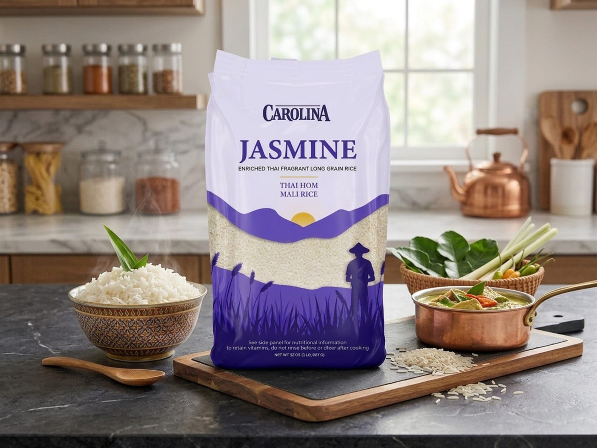
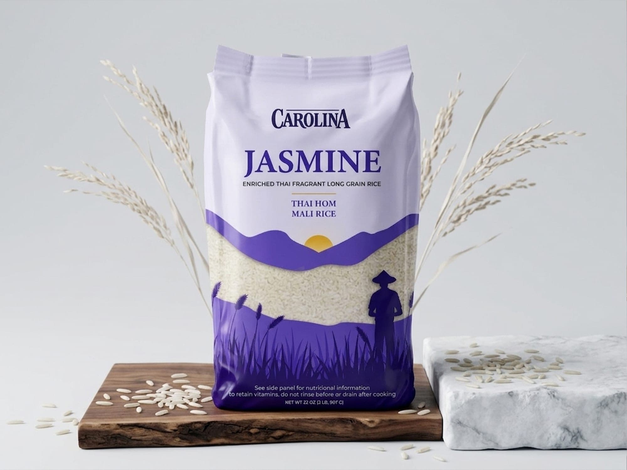
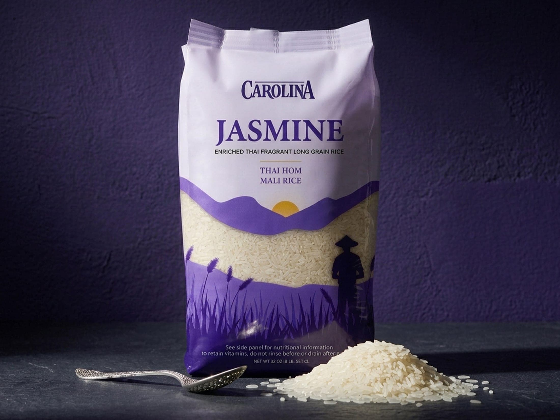
The direction centers on “Serene Authenticity”: an illustrated landscape silhouette of rice fields, a farmer, and a rising sun conveys origin and the aromatic character of Thai Hom Mali rice.
Deep violet and lavender hues replace the standard red-and-green grain-packaging convention, creating instant shelf differentiation.
Visual strategy
Typography & hierarchy
A custom high-contrast serif carries the “CAROLINA” brand mark with historical authority; “JASMINE” sits in a prominent tracked serif; sub-descriptors run in a crisp sans for a clean vertical stack.
Color & category distinction
A regal violet-to-lavender palette signals rich quality and exotic origin; a golden sun emblem draws the eye to the pack's center.
Integrated window
Rather than a plain die-cut window, the grain window is framed by an arched mountain-and-field contour, so the rice itself becomes part of the landscape illustration while still proving grain quality.
Packaging system
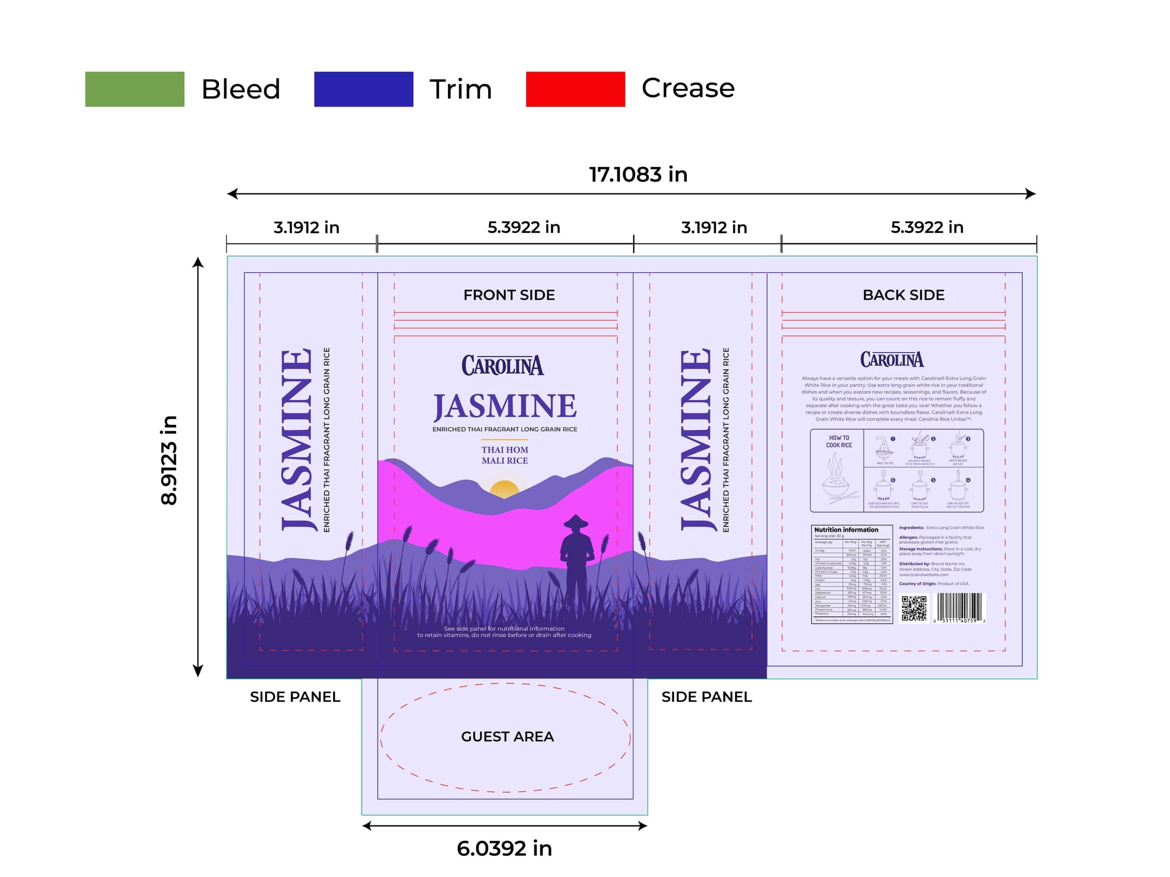
The purple rice-field silhouette flows continuously across the front, both side gussets, and the back panel. The back panel carries an eight-step cooking guide, full Nutrition Facts, barcode, and distributor details; an oval gusset base lets the bag stand upright with balanced weight.
Structure & production
- Custom flexographic dieline: 17.1083 in × 8.9123 in with a 6.0392 in bottom gusset
- Full 0.125 in bleed safety margin to prevent white margins during die-cutting and bag forming
- Continuous wrap-around visuals across front, gussets, and back
- Structured back-panel grid for the cooking guide, nutrition table, and barcode
Digital & physical presence
Retail shelf
Bold color blocking and the violet silhouette create a strong footprint even under variable store lighting.
Digital thumbnail
High contrast between the violet lower panel and light lavender header keeps the pack identifiable at 100px thumbnail sizes on grocery and delivery platforms.
Strategic differentiation, physical functionality, and production precision turned an everyday grain staple into a high-value product system built to win on shelf and perform from factory floor to kitchen counter.