Hyggeoxy Ceramic Bakeware
A warm, trustworthy packaging architecture for non-toxic ceramic baking sheets.
- Client
- Hyggeoxy
- Packaging
- Rigid folding carton
- Deliverables
- Packaging architecture · Dieline engineering · 3D rendering · Lifestyle presentation
01Challenge
Bakeware packaging tends to land at one of two extremes: over-technical, industrial aesthetics with no home warmth, or purely decorative designs that fail to communicate material safety and performance.
The carton needed to carry several differentiators at once (ceramic non-stick properties, non-toxic manufacturing, commercial-grade durability) without turning into a cluttered wall of claims.
02Strategy
Warm, organic visual texture pairs with a crisp, structured information layout. A subtle parchment background reinforces the home-baking experience rather than a lab-coat one.
Rather than lead with utility messaging alone, the system leans into the emotional comfort of wholesome cooking, anchoring the brand around safety, wellness, and culinary reliability.
03Design
Typography
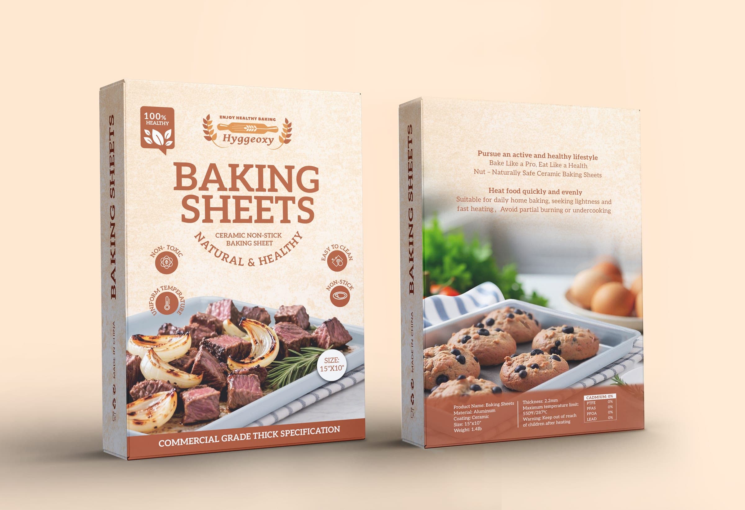
A high-contrast serif display pairs with clean sans-serifs for structured hierarchy and fast legibility.
Color palette
Textured cream parchment is anchored by deep terracotta and warm mahogany brown.
Imagery
A dual-photography strategy shows savory roasted meats on the front and sweet baked goods on the back, covering both use cases at a glance.
Iconography
Custom circular badges call out Non-Toxic, Uniform Temp, Easy to Clean, and Non-Stick.
Renders & mockups
4 images · tap to expand
04Production
A precision tuck-end outer carton accounts for fold allowances, glue flaps, and panel orientation, with an inverted top-flap logo for a premium unboxing moment and vertical side-panel type for warehouse stacking clarity.
Technical specs
- Carton dimensions: 38.7 × 25.8 × 3 cm
- Tuck-end structure with fold-allowance and glue-flap mapping
- Inverted top-flap logo print for unboxing presentation
- Vertical side-panel typography for warehouse stacking clarity
Dieline & production artwork
05Ecommerce
How the pack was designed to work on screen as well as on shelf.
Retail & e-commerce
High-contrast titles and clear iconography stay readable across physical displays and thumbnail-scale screens alike.
In the home
Contextual lifestyle imagery reinforces the emotional connection to home baking rather than positioning the product as a lab-tested commodity.
06Result
When visual hierarchy, technical transparency, and lifestyle positioning work together, a box becomes an active sales interface and a clear signal of product quality across every touchpoint.
07Why this packaging works
- Information hierarchy
- A high-contrast serif display with clean sans-serifs, and claims condensed into four circular badges: Non-Toxic, Uniform Temp, Easy to Clean, Non-Stick.
- Product communication
- Savory roasted meats on the front and sweet baked goods on the back show both use cases at a glance.
- Differentiation
- Home-baking warmth replaces the over-technical, industrial look common in bakeware.
- Ecommerce & thumbnail
- High-contrast titles and clear iconography stay readable on physical displays and thumbnail-scale screens alike.
- Production
- 38.7 × 25.8 × 3cm tuck-end carton with fold-allowance and glue-flap mapping, plus vertical side-panel type for warehouse stacking.
Have a similar product?
Start a kitchenware packaging project.
Related service: Packaging Design. Strategic packaging design from concept to production-ready artwork, the core of everything Chopra Creative does.