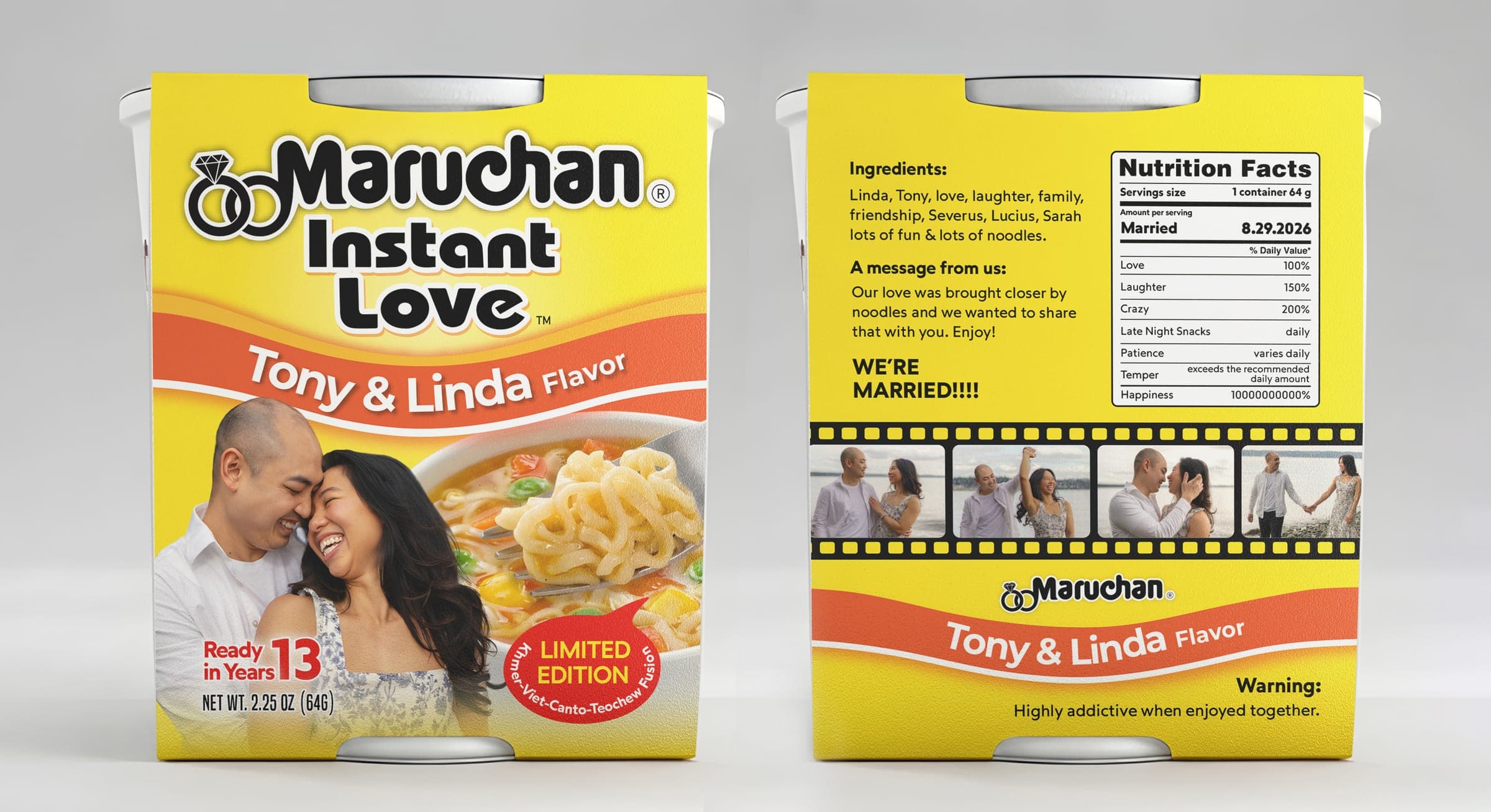
Maruchan Instant Love
Reworking an iconic mass-market cup-noodle wrap into a bespoke wedding-favor keepsake.
- Client
- Tony & Linda
- Packaging type
- Printed cardstock outer sleeve for a cup container
- Scope
- Packaging redesign & parody brand strategy · Production artwork & dieline layout · 3D rendering & mockups · Contextual lifestyle mockups
The challenge
Translating a universally recognized mass-market wrap into a personal keepsake demands extreme fidelity to the source system's hierarchy, weight, and spatial balance while completely replacing the messaging with new photography and copy.
The flat sleeve also had to wrap cleanly around a tapered cup: once folded and taped, every panel boundary needed to stay square and continuous.
Creative direction
The direction balances nostalgic familiarity with personal storytelling — keeping the iconic yellow field, red swoosh, and blocky type so the format is instantly recognizable, then rewriting every line for the couple.
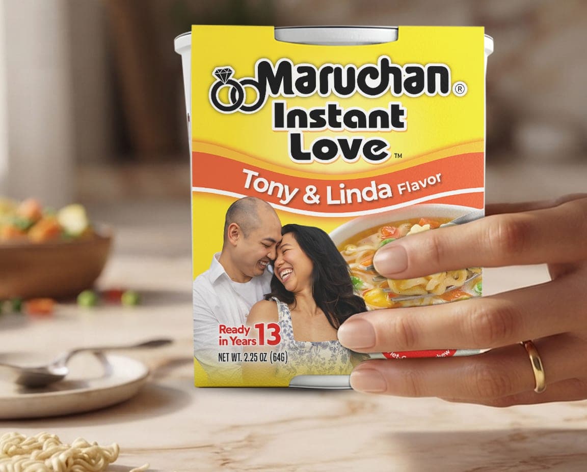
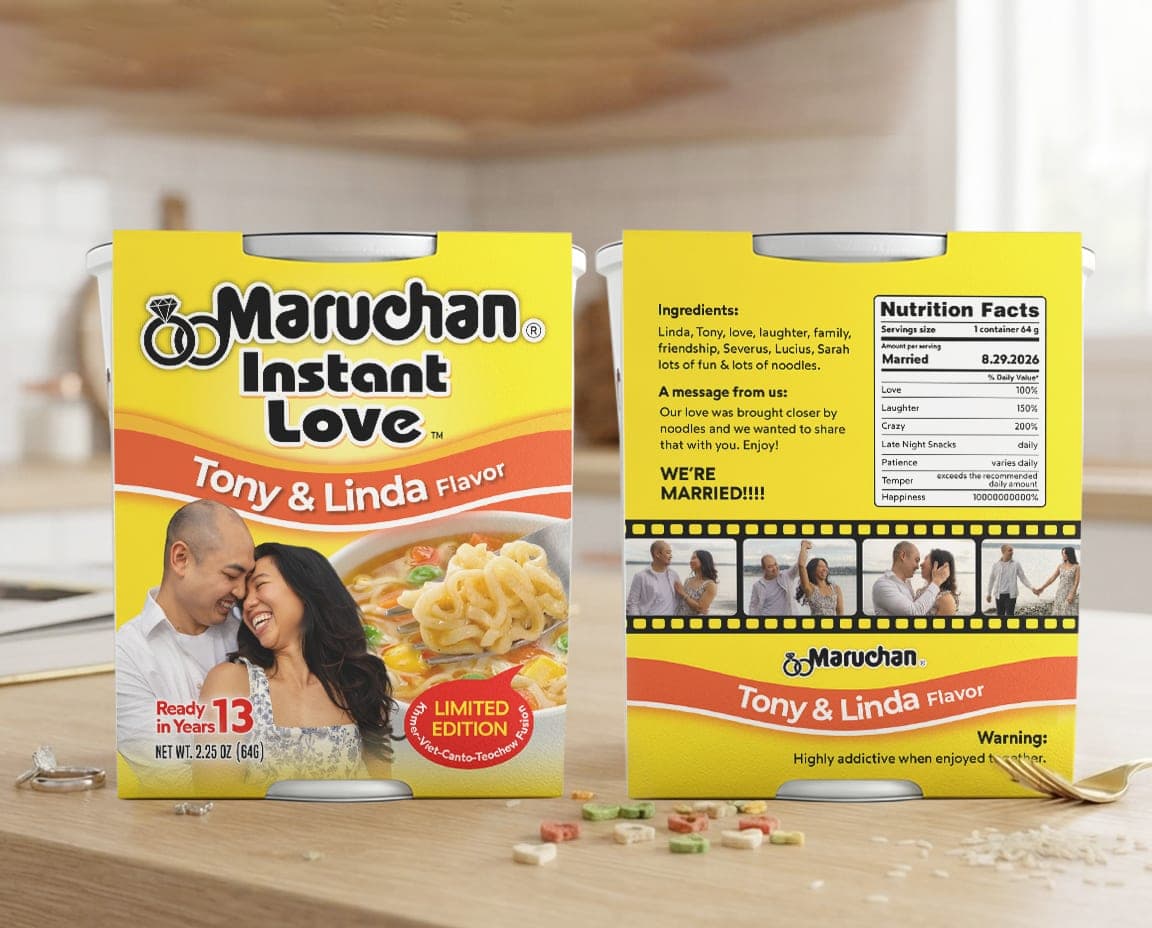
“Instant Lunch” becomes “Instant Love™” with an interlocking-ring motif; the cook-time callout becomes “Ready in 13 Years”; the flavor line becomes a heritage callout celebrating the couple's shared background.
Visual strategy
Typography
High-contrast bold sans with white strokes and drop shadows matches classic food-packaging convention, keeping the parody legible and authentic.
Color
The saturated yellow and orange-red gradient leans on decades of comfort-food familiarity, so the format reads as authentic rather than a generic template.
Layout & hierarchy
The wordmark and ring icon anchor the top; the flavor callout curves across a central red banner; couple photography sits level with product imagery so emotion and product context carry equal weight.
Packaging system
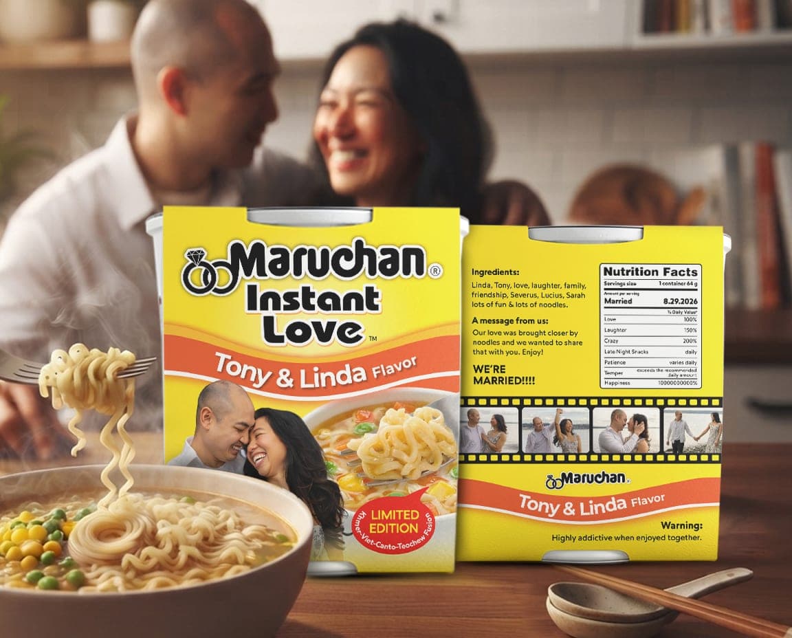
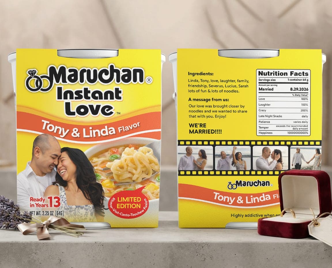
The design runs as a continuous four-panel wrap (front, top, back, adhesive flap) calculated for a tapered cup. The back panel replaces regulatory copy with a wedding-photo filmstrip, a personalized “Nutrition Facts” table (Love 100%, Laughter 150%), and an event date stamp.
Structure & production
- Dieline continuity marked with fold and bleed/crop guides
- A dedicated “Kleen Stick” adhesive zone for clean hand or mechanical assembly
- Panel geometry oriented for the cup's curve and taper to avoid distortion once glued
- Structural margins protect the closing line (“Warning: highly addictive when enjoyed together”) from trim or seam loss
Digital & physical presence
In hand
Paper weight and clean panel transitions give the sleeve a tactile, retail-grade feel despite being a one-off run.
On screen
High color contrast and bold black-and-white type keep the design legible in portfolio galleries and social presentation decks.
Packaging is a complete physical and visual system, not just a graphic — whether it's a retail CPG line or a one-off keepsake, the discipline is the same: structural accuracy, brand hierarchy, and production boundaries.