MitroCore NAD+ Advanced
Engineering a modern clinical identity for a liposomal cellular-health supplement.
- Client
- MitroCore
- Packaging type
- Full-wrap label on a low-profile wide-mouth jar
- Scope
- Brand integration · Print-ready artwork · Mechanical dieline · 3D render presentation · Lifestyle visuals
The challenge
The supplement category is crowded with dense medical claims and regulatory tables that leave little room for a clean front panel. MitroCore needed to convey bio-scientific rigor — liposomal absorption, NAD+ support — while staying legible on a small e-commerce thumbnail.
The brief called for a systematic panel hierarchy so core benefits wouldn't compete with mandated nutrition and safety copy, and for dieline precision tight enough to survive production without error.
Creative direction
The direction centers on “Accessible Science”: a desaturated teal/cyan substrate paired with deep slate-blue text, instead of a cold pharmaceutical palette. It reads as pure, hydrating, and biotechnological without losing warmth.
Decorative flourishes were stripped back in favor of generous spacing and purposeful type, positioning MitroCore as a trustworthy daily-health essential.
Visual strategy
Typography & hierarchy
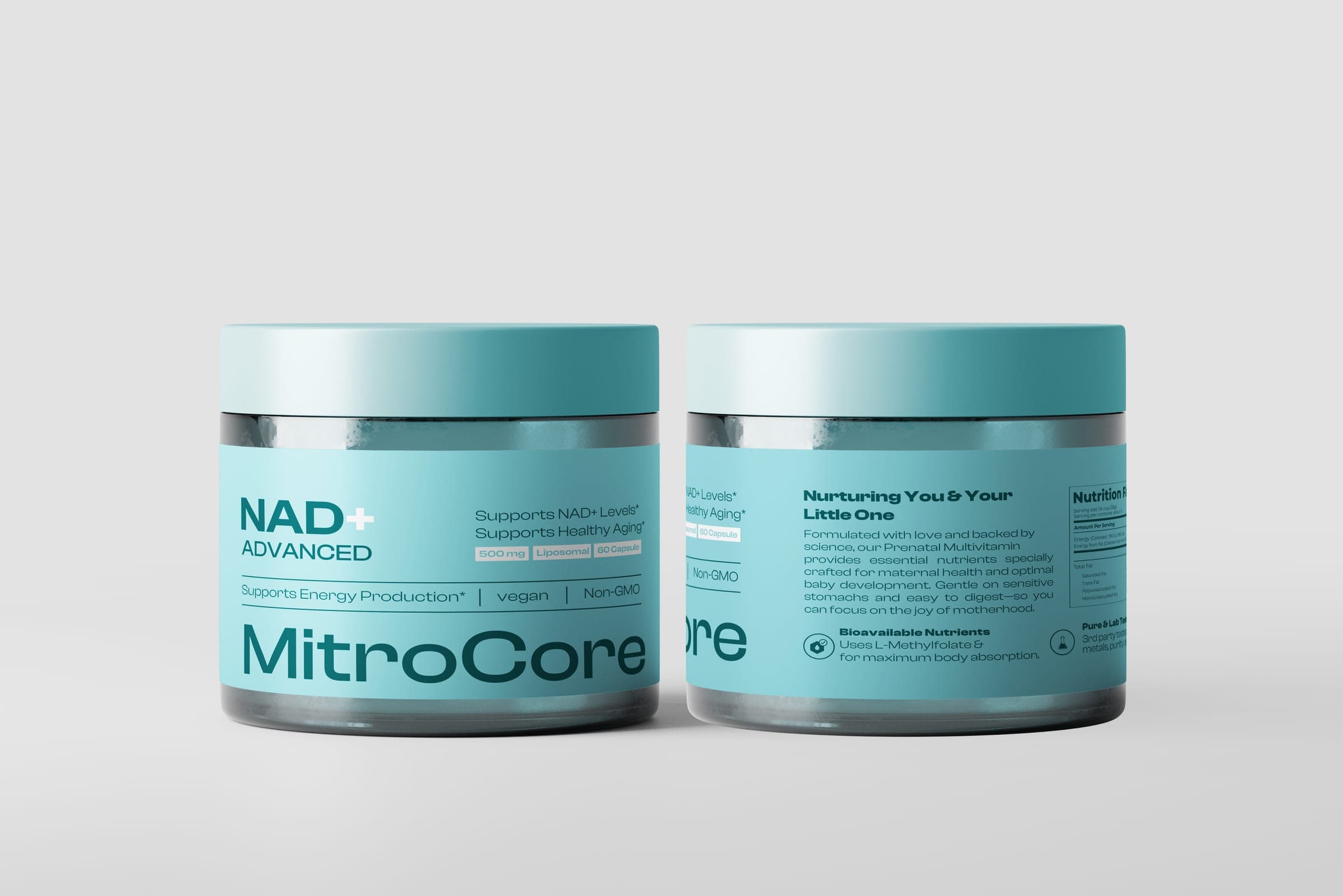
A bold geometric wordmark anchors the base of the front panel; “NAD+ ADVANCED” sits in widely spaced uppercase for instant category recognition at a glance.
Color architecture
Soft desaturated teal against deep slate-blue text keeps contrast high for legibility under variable lighting and meets digital accessibility standards.
Front-of-pack structure
The 90mm front panel is organized into three tiers — benefit statement, supporting claims, and pill-shaped dosage badges (500mg Liposomal, 60 Capsules).
Graphic system
Custom line-art icons carry bioavailability, lab-testing, and digestion claims on the side panels, cutting visual noise while speeding up label scanning.
Packaging system
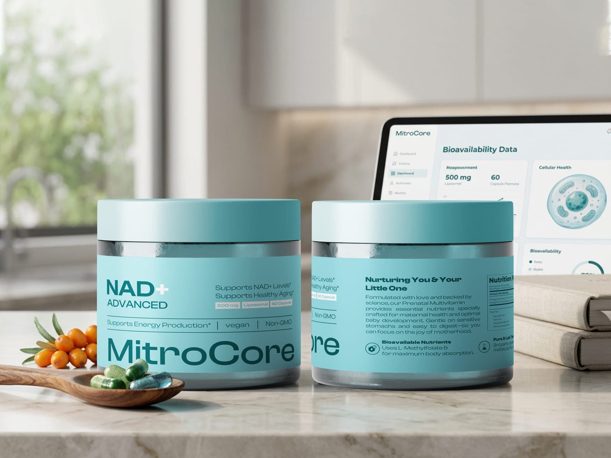
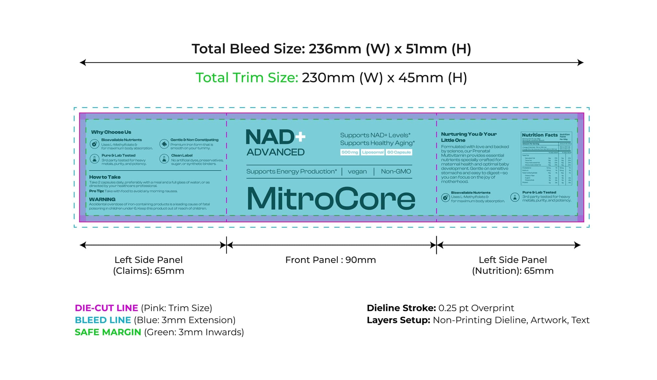
The label wraps as a continuous three-panel system engineered for cylindrical jar geometry: a 90mm front panel carries the brand mark and hero claim; a 65mm left panel holds brand story, usage directions, and safety copy; a 65mm right panel carries the nurturing narrative and the standardized Supplement Facts table.
Structure & production
- Total trim size: 230mm × 45mm
- Total bleed size: 236mm × 51mm (3mm perimeter extension)
- Safe margin: 3mm inward buffer protecting text from die-cut variance
- Dieline stroke: 0.25pt overprint on a dedicated non-printing layer
- Layer separation: dieline, background art, visual elements, live text
Digital & physical presence
E-commerce & digital
High-contrast type and clear badge structure keep the product name, dosage, and core claim legible even scaled down to a 100px thumbnail.
Countertop presence
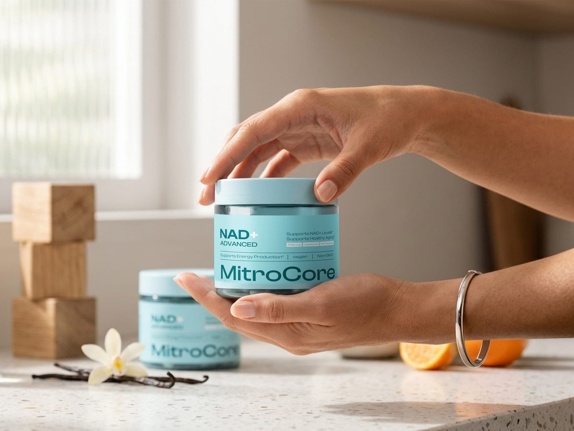
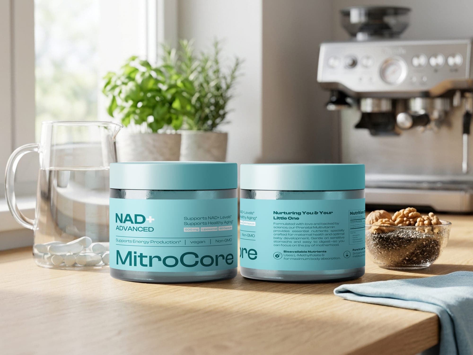
The muted palette lets the jar sit naturally on a kitchen counter, supporting daily-habit visibility rather than fighting for attention.
Structured panel hierarchy and accurate dieline engineering let MitroCore satisfy every regulatory requirement while still reading as a premium, trustworthy daily supplement — on screen and on the shelf.