Amazon · 3 min read
Amazon Packaging Design: Making a Pack Work as a Main Image and Thumbnail
On Amazon, your package is often the main image. That means the front panel has to work at a size far smaller than anyone designs at.
For many products sold on Amazon, the main image is simply the package, photographed or rendered on a white background. That makes Amazon packaging design less about a separate marketplace style and more about whether the pack itself can do its job at a few hundred pixels, or less, in a crowded search grid.
The main image is your package, small
Amazon's main image rules are stricter than the rest of the listing. The widely documented basics are a pure white background and the product filling most of the frame, with limits on added text and graphics. The details change over time, so check Amazon's current image requirements for your category before you shoot or render anything.
The practical consequence is that you cannot rely on overlays to explain the product in the main image. The front panel has to explain it on its own. If the pack only makes sense at arm's length, it will not make sense in search results.
Design for the thumbnail, then check the shelf
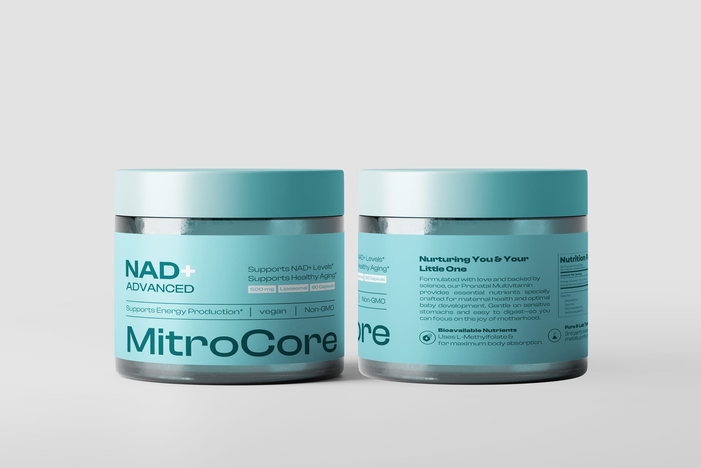
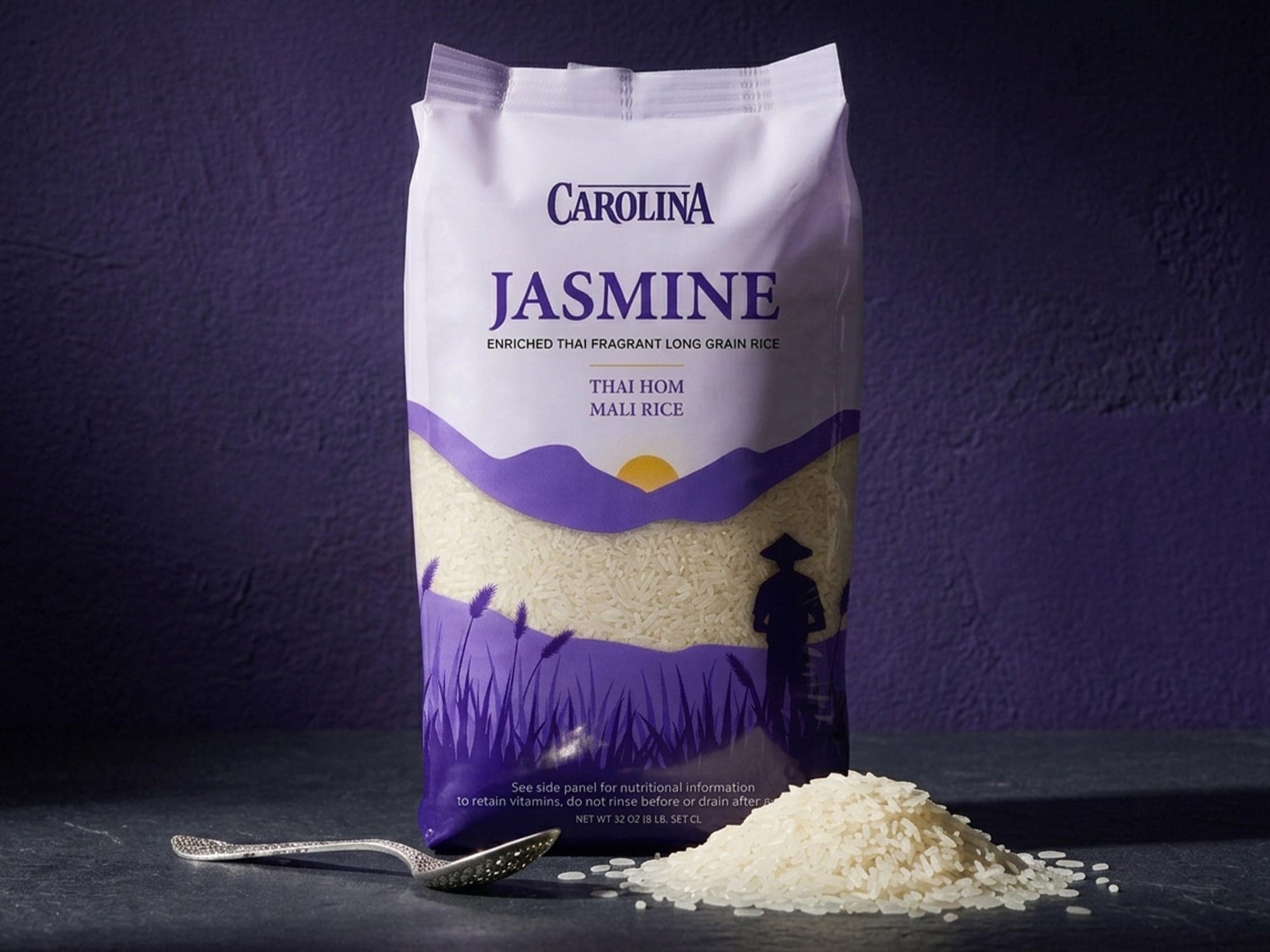
I check every front panel scaled down to roughly a 100px thumbnail. It is a blunt test, and it is useful. On MitroCore, high-contrast type and a clear badge structure were chosen so the product name, dosage and core claim stay legible at that size. On Carolina, the contrast between the violet lower panel and the light lavender header keeps the pack identifiable at thumbnail scale on grocery and delivery platforms.
- Can you read the product name without zooming?
- Is the product type obvious from shape, color and one or two words?
- Does one clear block of contrast hold the eye, or does the pack turn to texture?
- Can a shopper tell your variants apart side by side?
What survives at small sizes
Fine detail, thin type, low-contrast palettes and long claims are the first things to go. What survives is large type, strong value contrast between zones, a recognizable silhouette and a simple, repeatable layout. None of that requires a loud design. MitroCore uses a muted, desaturated palette and still reads, because contrast and spacing do the work rather than saturation.
Render-ready from the start
Because the main image is so often a render or a studio shot of the pack, the artwork should be built so it can be rendered cleanly: accurate dieline, correct proportions, panel wrap that holds on a curved or gusseted form. A pouch that looks flat and lifeless in a render will look the same in search.
Shape matters here too. A jar, pouch or carton photographed straight on gives different amounts of usable front panel. Design the main face knowing which angle the main image will use.
If your product is already on Amazon and you suspect the pack is not reading at search size, the Product Launch Audit reviews packaging and Amazon presentation together and gives you a prioritized list of what to change.