Hierarchy · 3 min read
Packaging Hierarchy: What a Shopper Must Understand First, Second, and Third
Every front panel answers questions in a fixed order. Hierarchy is the decision about which question gets answered first, and which can wait.
Most packaging problems I get asked to fix are not color problems or font problems. They are order problems. The front panel is trying to say six things at the same volume, so the shopper hears none of them. Good product packaging design starts by deciding what someone must understand first, second, and third, and then designing so that order is impossible to misread.
First: what is this?
The first read is category and product. Before a shopper cares about your brand story, they need to know they are looking at the right kind of thing. A dog food that reads like a treat, or a supplement that reads like a skincare jar, loses the shopper before the brand gets a chance.
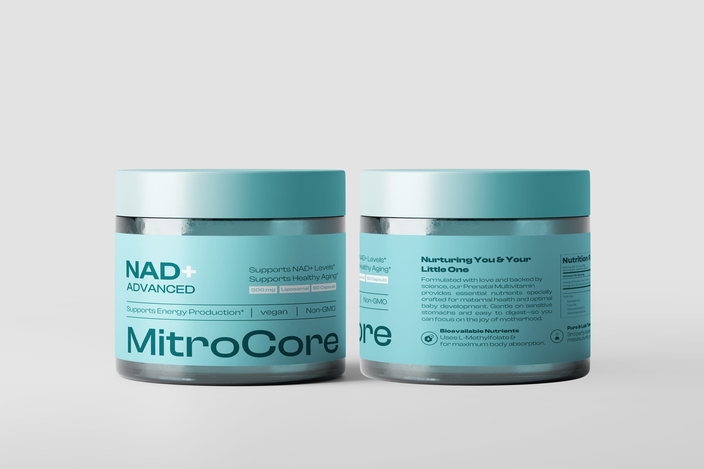
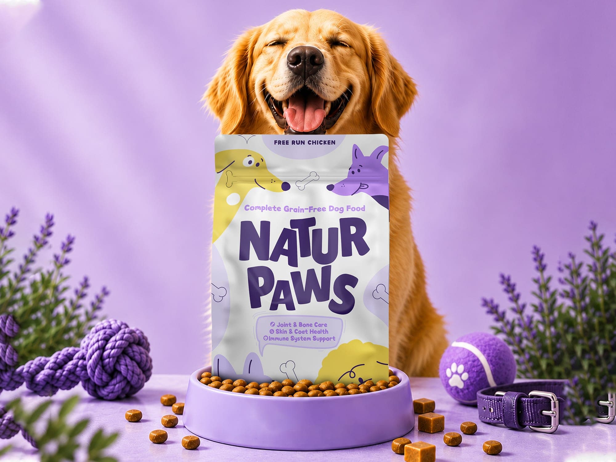
On the MitroCore label, the line "NAD+ ADVANCED" sits in widely spaced uppercase for exactly this reason: category recognition comes before anything else. On Natur Paws, the protein variant, "FREE RUN CHICKEN", anchors the top of the pouch so the shopper knows which recipe they are holding at a glance.
Second: why this one?
The second read is the reason to choose it over the product next to it. This is usually the brand mark plus one hero claim. It is not a list of benefits. One claim, stated plainly, at a size that holds up at arm's length.
Natur Paws puts an oversized wordmark in the middle of the pack. MitroCore organizes its 90mm front panel into three tiers: a benefit statement, supporting claims, then pill-shaped dosage badges. Each tier is visibly smaller and quieter than the one above it, so the eye moves down rather than around.
Third: can I trust it, and does it fit me?
The third read is proof and fit: dose, count, weight, flavor, key certifications, functional benefits. This information matters, but it only gets read once the first two questions are answered. It belongs in a structured, consistent zone, often badges or a short benefit row, not scattered across the panel.
- Tier 1: category and product name, readable at shelf distance and at thumbnail size.
- Tier 2: brand mark and a single differentiating claim.
- Tier 3: dose, count, variant details and benefit badges, grouped together.
- Everything else: side and back panels, where regulatory and story copy can breathe.
Moving the rest off the front
The hardest part of hierarchy is deciding what leaves the front panel. Supplement packaging design is a good test because the category carries dense claims and mandated tables. On MitroCore, brand story, directions and safety copy moved to a 65mm left panel, and the nurturing narrative and Supplement Facts table moved to a 65mm right panel. The front panel stayed clean because the side panels were planned to do real work.
A simple test helps here: shrink the front panel to the size of a phone thumbnail and look at it for two seconds. If you can name the product and the reason to buy it, the hierarchy is working. If you can only see a logo and a texture, it is not.
Hierarchy is usually the first thing I settle when a new product is heading to market, before palette or illustration. If you are preparing a launch and want the front panel planned in that order from day one, that is the core of the Product Launch engagement.