Amazon · 3 min read
Amazon Product Images: The Job of the Main Image and Each Secondary Image
A strong image stack is not seven nice pictures. It is a sequence where each image answers one question a buyer has before they purchase.
An Amazon listing gives you a main image and a set of secondary images. Treating them as a gallery of attractive shots wastes most of that space. The better approach is to treat the stack as a sequence: the main image earns the click, and each secondary image answers one question a buyer has before they commit.
The main image earns the click
The main image has one job: make the product recognizable and appealing in search results. Its rules are the strictest on the listing, typically a pure white background with the product filling most of the frame. Check Amazon's current image requirements before producing it. For packaged goods, this is usually the pack itself, which is why the front panel's hierarchy matters so much.
Secondary images answer questions
Once a shopper is on the listing, they are trying to resolve doubts. Each secondary image should take one doubt and resolve it. A useful way to plan them is to write the buyer's questions first, then assign one image per question.
- What exactly do I get? Contents, count, size, what is in the box.
- Why this one? The two or three key benefits, stated plainly.
- How does it work or how do I use it? Steps, directions, preparation.
- Will it fit my life? Scale, in-use or lifestyle context.
- Can I trust it? Ingredients, materials, certifications you can actually substantiate.
- Which option is right for me? Variants, sizes or flavors compared.
Infographic logic
Infographic images fail when they try to say everything. A good one has a single headline, a small number of supporting points, and a visual that proves the point rather than decorating it. Icons help when they are consistent and labeled. They hurt when they are generic and unexplained.
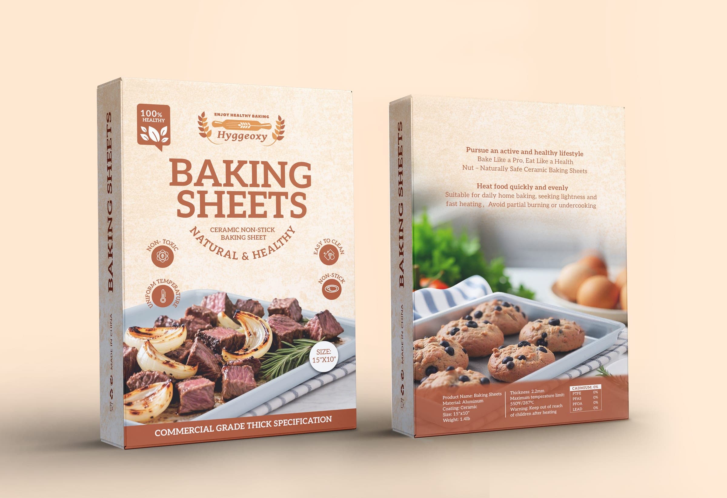
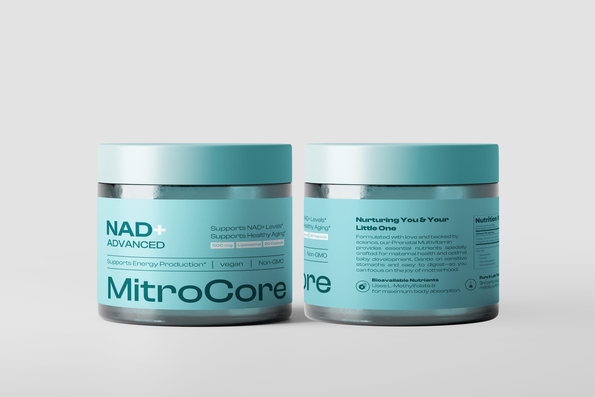
The packaging often already contains this logic. Hyggeoxy's carton uses four circular badges (Non-Toxic, Uniform Temp, Easy to Clean, Non-Stick) to carry its differentiators without a wall of copy. MitroCore's side panels use custom line-art icons for bioavailability, lab-testing and digestion claims. Those systems translate directly into benefit images: same icons, same language, more room to explain.
Keep the visual language consistent
Secondary images should look like they came from the same brand as the package. Same type, same palette, same icon style, same tone. When the infographics are built in a different visual language from the pack, the listing feels assembled rather than designed, and the shopper has to re-learn the brand on every image.
Remember that many shoppers browse on a phone. Headlines need to be large, points few, and text kept well clear of the edges.
Building packaging and Amazon imagery from one shared system is the center of the Brand Growth System. The image stack is planned from the same hierarchy and assets as the pack, so they reinforce each other.