SKU systems · 3 min read
Packaging Systems for Multiple SKUs: Building a Modular Matrix That Scales
A product line needs a system, not five separate designs. The trick is deciding what stays fixed and what is allowed to change.
When a brand has one product, packaging is a design problem. When it has five, it becomes a systems problem. Each new flavor, size or formula has to look like part of the same family while being easy to tell apart. Designing each SKU on its own almost always breaks one of those two goals.
Separate fixed zones from variable zones
The first step is deciding which parts of the pack never change and which parts carry the variant. Fixed zones build brand recognition across the range. Variable zones do the work of telling SKUs apart. If too much is variable, the range stops looking like a family. If too little is, shoppers grab the wrong one.
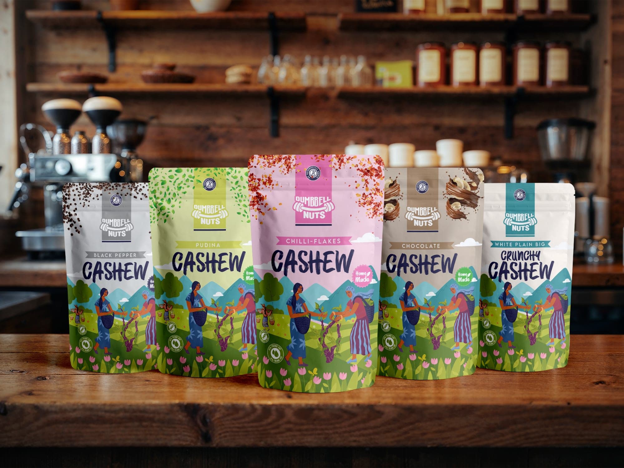
The Dumbbell Nuts cashew range runs on a modular visual matrix with five parts: a top-seal flavor graphic, a branding zone, a color-coded flavor banner, a brush-script product name, and an illustrative base. The branding zone, the brush script and the harvester landscape at the base stay consistent. The flavor graphic and the banner color change per SKU.
Color coding that does real work
Color is the fastest way to separate variants, but only if each color is assigned deliberately and kept distinct. On Dumbbell Nuts, each flavor has its own coding:
- Pudina: leaf green.
- Chilli-flakes: soft pink.
- Chocolate: muted taupe.
- Black pepper: slate grey.
- White plain crunchy: crisp teal.
Because the banners sit in the same position on every pouch, a row of mixed flavors forms horizontal bands across the shelf. The eye can take in the whole range at once and then find the one it wants. That only works because the position is fixed and only the color moves.
Build for the SKU you have not launched yet
A system is only as good as its next addition. Before finalizing, test it: invent a sixth variant and see if it slots in cleanly. Is there a color left that is distinct from the others? Does the product name fit the same zone if it is longer? Does the ingredient overlay at the top seal still work for a less photogenic flavor?
Production matters here too. Keeping one dieline and one back-panel grid across the range (Dumbbell Nuts uses a structured back panel for the ingredient diagram, Nutrition Facts, FSSAI licensing and barcode) means each new SKU is mostly an artwork swap, not a new engineering job.
Check the system in both places it lives
In food packaging design especially, a range is judged on a shelf and in a scrolling list of thumbnails. The Dumbbell Nuts layout keeps a clean vertical hierarchy and oversized brush typography so "CASHEW" stays readable at mobile thumbnail size, while the banners handle variant recognition up close.
If you are planning a line rather than a single product, or adding SKUs to a range that was never designed as a system, the Brand Growth System includes a SKU system built to scale with you.
See it in practice