Production · 3 min read
Common Packaging Design Mistakes That Fail on Shelf or on Press
Most packaging failures are predictable. They fall into two groups: the pack does not communicate, or the file does not survive production.
Packaging fails in two places. It fails on shelf when a shopper cannot tell what it is or why to pick it. It fails on press when the file was never built for the structure it is printed on. The mistakes behind both are predictable, which means most of them can be caught before money is spent on a print run.
Mistakes that fail on shelf
- Every claim at the same size, so nothing leads.
- A brand mark that dominates while the product type is hard to find.
- Following category color conventions so closely that the pack disappears among competitors.
- Low contrast that looks refined on a monitor and muddy under store lighting.
- Variant information (flavor, size, dose) that is too small to tell SKUs apart.
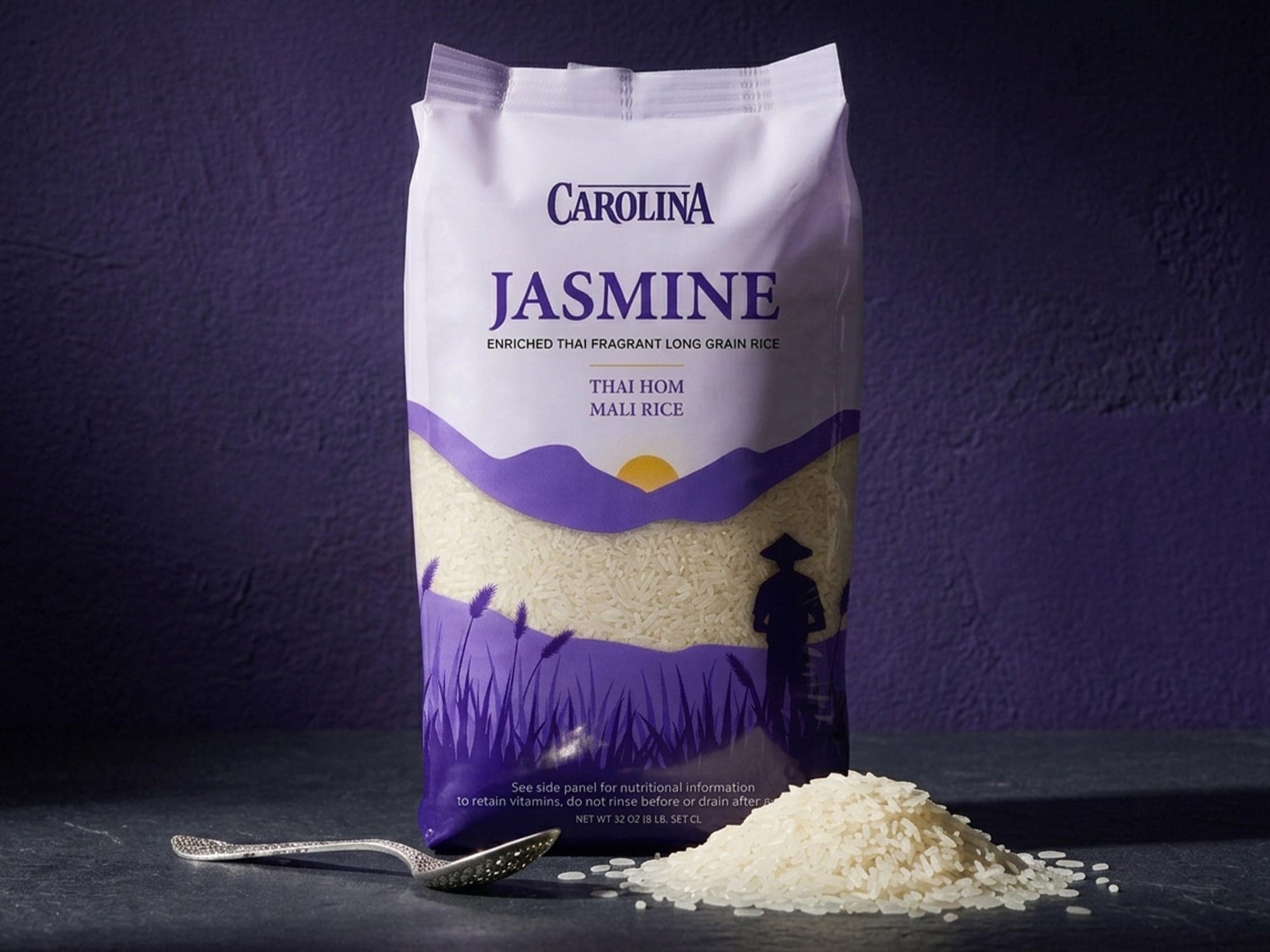
The color point deserves a note. Following conventions helps shoppers recognize a category, but copying them exactly makes you invisible inside it. The Carolina jasmine rice pouch moved to deep violet and lavender instead of the familiar red-and-green grain-packaging palette. It still reads as rice because the illustration and the grain window do that job, so the color is free to differentiate.
Mistakes that fail on press
- Artwork that stops at the trim line, with no bleed.
- Text or logos placed inside the safe margin, where die-cut variance can clip them.
- Barcodes on seals, gussets or curved areas that flex or distort.
- The dieline merged into the artwork instead of sitting on a non-printing layer.
- Panels designed flat without checking how they read once folded or filled.
These are rarely design-skill problems. They come from designing the front panel in isolation, then fitting it to a structure at the end. By then, the claim that needed to sit on the front is half on a glue flap.
Too much on the front, not enough on the back
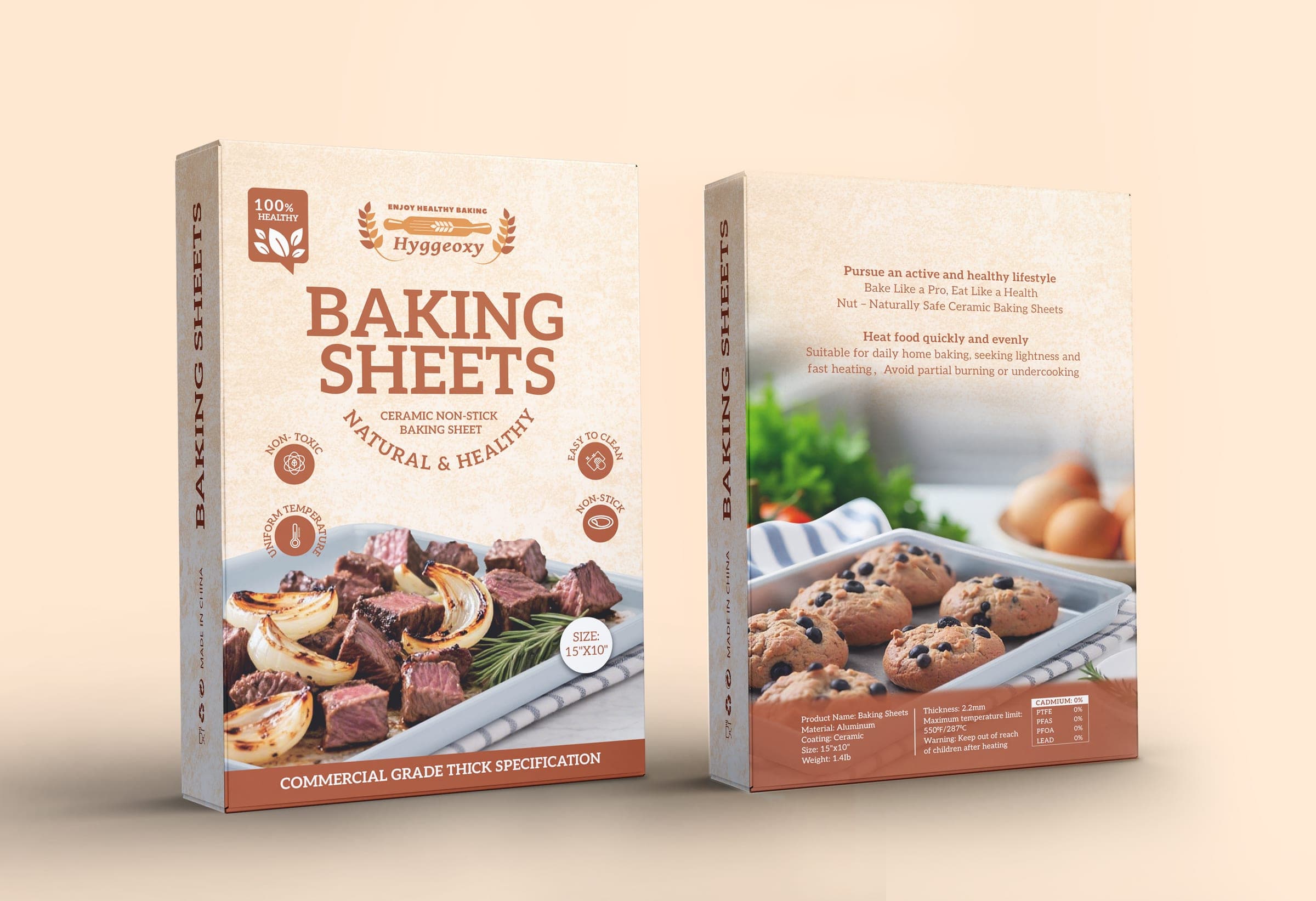
A common mixed failure: every differentiator gets pushed onto the front panel, and the back panel becomes an afterthought. Hyggeoxy had several things to say at once: ceramic non-stick, non-toxic manufacturing, commercial-grade durability. Instead of a wall of claims, the carton uses four circular badges (Non-Toxic, Uniform Temp, Easy to Clean, Non-Stick) and a dual-photography approach, with savory dishes on the front and baked goods on the back. The message is split across panels by role, not crammed onto one.
Catching them early
In food packaging design and most other categories, a 3D render of the actual structure is one of the cheapest checks available. It shows whether panels line up across folds, whether wrap-around art stays continuous, and whether key copy survives the curve or the gusset. It does not replace a printer's proof, but it catches a lot before you get there.
If you already have packaging and want a clear read on what is working and what is not before you reprint or launch, the Product Launch Audit is a focused review of exactly these points.