Ecommerce · 3 min read
From Packaging to Ecommerce: One Visual System from Pack to Product Page
Packaging, marketplace images and your own store are usually designed separately. They work better when they are built from one system.
Most brands get their visual identity in pieces. Packaging is designed by one person, Amazon images by another, the Shopify store by a third. Each piece can be good on its own and the whole still feels disconnected. The fix is not more design. It is designing everything from one system that starts with the package.
Why the package is the source
Packaging is the most constrained piece. It has fixed dimensions, regulatory copy, a print process and a physical structure. When the system holds up under those constraints, it will hold up almost anywhere. Starting from a website and trying to squeeze it onto a pouch tends to go badly. Starting from the pouch and expanding outward tends to go well.
A well-built pack also hands you the parts ecommerce needs: a type hierarchy, a palette with known contrast, an icon set, a set of claims already ranked by importance, and imagery or illustration that defines the brand's world.
What carries over
- Hierarchy: the front panel's first, second and third reads become the order of your product page.
- Color architecture: brand colors, plus variant colors for multi-SKU lines.
- Typography: the same faces and weights, adjusted for screen sizes.
- Icons and badges: the same set, used on pack, in listing images and on the product page.
- Illustration or photography style: one world, not three.
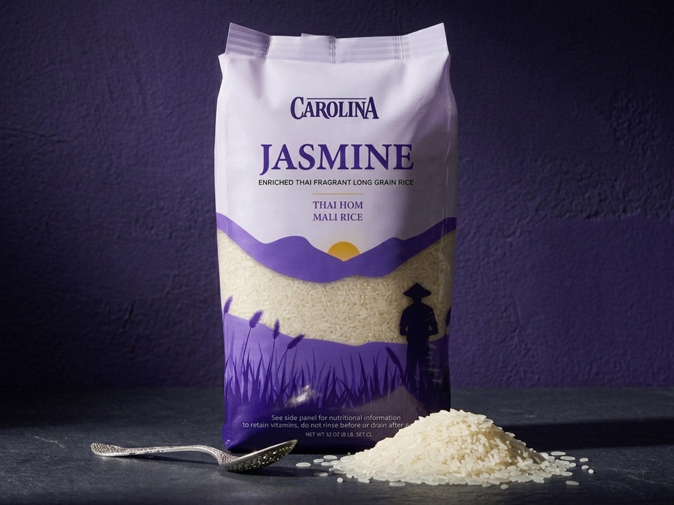
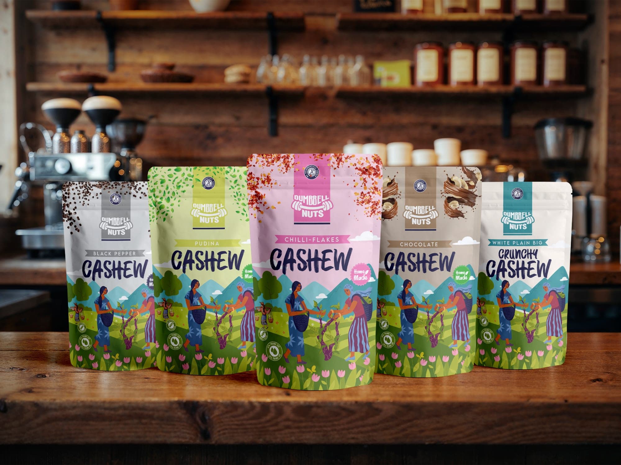
Carolina is a good example of an asset that travels. Its purple rice-field silhouette flows continuously across the front, both gussets and the back panel. A landscape built to wrap around a pouch is also a ready-made banner, background or section divider for a product page. Dumbbell Nuts' flavor colors work the same way: the codes that separate pouches on a shelf can separate variants in a product selector.
What has to adapt
Some things do not translate directly. Back-panel text is set for reading in hand, not on a phone. Dense regulatory layouts need to become clean, scannable sections. Ecommerce product design also needs assets the pack never had: lifestyle scenes, scale shots, in-use steps and comparison graphics. These should still be built from the system, not invented from scratch for each channel.
Shopify and Amazon are different jobs
On Amazon, you work inside a fixed listing format and compete next to other products. On your own store, you control the whole page and the shopper is already there for you. Shopify product design can go deeper into story, the range and use cases. Both should draw from the same system, but the content emphasis is different.
Building packaging, Amazon creative and Shopify product creative as one connected system is what the Brand Growth System is for. It starts with the pack and carries it through to every page where the product is sold.